Rush University Medical Center Main Street

Rush University Medical Center Main Street
Bridging Time and Space
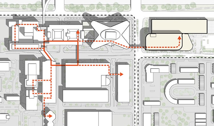
Our master plan for Rush University Medical Center’s multiphase renovation connects the campus and provides a unified path into the future. The plan creates a cohesive brand and clear wayfinding throughout a cluster of five buildings that were built in different eras and have distinct infrastructures.
The foundation of the project is the Main Street corridor, which passes over Harrison Street and Paulina Street and branches out to hallways connecting the rest of the campus. It is a single loop that can be easily seen from both inside and outside of the space. By pulling Main Street to the periphery of each building’s exterior that faces the loop, our renovations provide seamless navigation between buildings which were not meant to be connected. The project began as a simple renovation, but as the campus’ greater needs became clear, the scale of this connection network increased.

Finding an Easier Way With Easy Wayfinding
Arrival and knowing where to go next are critical to the patient journey. The original campus plan features a unique layout where users enter through a car drop-off area and into a service hallway in the Joan and Paul Rubschlager Tower, a distinct butterfly-shaped building. They then make their way up an elevator to the fourth-floor reception area in the neighboring Atrium Building, which houses the front desk and provides access to the rest of the facilities.
This path could be confusing for patients, families or even staff. An earlier phase of the renovation revitalized the atrium and car drop-off area to the atrium to fit the “One Rush” brand and made navigation between the two spaces easy and intuitive with clear signage and open sightlines. Specific materials were used for the flooring and ceiling to lead users to their destinations. For example, grey terrazzo was used on the south side of the corridor to lead people towards the Armour Academic Center and Jelke Building, while white terrazzo was used to lead them towards the Kellogg Building. The renovation also provided an opportunity to create more space for donor-provided art pieces and features.
An Elevated Space Grounded in the Community
Much of the key space within the campus is located on the fourth floor, a result of 1960s-70s architecture trends that aimed to keep the user experience sheltered from the commotion of the street. During the renovation, we incorporated more modern elements which prefer to keep spaces in tune with their surrounding communities as much as possible.
The facade of the drop-off and atrium areas are designed to emphasize a connection between the street and interior, featuring large windows that let in natural light and provide more space inside. With our renovation moving much of Main Street to the periphery of the space, much of the corridor has new access to natural light and views of the outside as well, which is essential in a patient’s wellness journey.
Main Street also features a distinct lighting linear fixture lighting layout, with lights placed in a random yet intentional pattern delineating nodes along the path. This makes the corridor easily identifiable from the street and draws a visual line through the campus, bolstering navigation through it while adding to its sense of cohesion and belonging within the neighborhood.
Our work on this project exemplifies our planning expertise and ability to solve complex design problems. It will serve as an influence on future campus planning projects as an emphasis on interconnectivity continues to grow.


